Now that I have no longer been updating my posts via this blog about my design work, I am posting tweets to keep me commercially aware of what's out there in the creative industry.
Please feel free to follow me via this link! :)
Friday 12 October 2012
Saturday 11 August 2012
Tuesday 7 August 2012
What to read?
So why was I looking in this section in particular? Recently I have been stumbling upon endless questions that had been questioning my inner psyche.It wasn't until the more I was catching up with my friends back here in Hong Kong that I realised that it is a vital time to reflect upon my achievements, my goals, who I am, what do I want to achieve and where to I want go?
Of course action speak louder than words. So there's no point rambling in my mind all these questions. They are inevitably only going to make my mind tired and . I need to find a way of achieving this goals. Making these words spring into ACTION.
This book is probably an indirect approach but will be of guidance in helping me as what the book states: 'to unlock my potential...find courage, inspiration, success and happiness'. Do these words not epitomise what people would like to acquire and pursue? Dare you to say no but these words definitely sprung qualities of what I would like to be defined with. Wouldn't anyone?
I stood staring at a bold red book. 'The Tools' by Phil Stutz and Barry Michels. Okay, so it's recommended by one if its staff. I guess it could be good. I can't help but notice the 'Hollywood's open secret' credential by The New Yorker. From a graphic perspective, the design it not bad at all It actually makes me want to read it. It's simple graphics- focus on the type, seems to wrap up that it will be a straight forward, no-fuss read. I wanted to skim read a few pages but it was plastic wrapped. I'm always reluctant about buying a book I don't know about but there was something about this book that was telling me to buy it. I couldn't leave it there. It was the last one on the shelf as well. I gave in. It must be a good read I thought to myself.
My curiosity did get the better of me and as soon as I bought it, I unwrapped the wrapping like a child on Christmas day wondering if I had bought a book that was worth buying. Mixed emotions reading the first few lines but I had to give it a chance. I was walking home and I couldn't help myself carrying on reading it as I was walking my way home. This is pretty darn interesting. Let me read a little more.
I got home and found myself glued to the book. I couldn't put it down. Was it because I was intrigued by what Stutz had to say or the approaches he was describing in his book? Will this change my life? Is this true? Will it work? Who knows, I guess I can only find out by trying his techniques. However, even before trying out his techniques the tone of voice of the narrative induces a sense of calm, expresses a sense that readers will grow and reassurance that everything will be okay, if not better.
I can't wait to apply these techniques to my life and foresee a brighter future that it awaiting through conquering fears, embracing challenges and times of adversity! Off i go to continue reading.
Friday 3 August 2012
Illustration in progress
I am working on a few illustrations as part of my leisure.
Here's one that I worked on this afternoon...
The illustration not yet finished but I thought I would show you the progress.
What do you think?
Here's one that I worked on this afternoon...
The illustration not yet finished but I thought I would show you the progress.
What do you think?
 |
| Maeko-san © Kasumi Miyake 2012 |
Wednesday 1 August 2012
What's hot? What's not?
 |
| HK Station Samsung Advert © Kasumi Miyake 2012 |
It was hard not to notice this advert advertising Samsung Galaxy. Environmental and spatial advertising used at its advantage. Who knows how many Hong Kongers walk by this walk way to commute to and away from the center. Samsung Galaxy is another hot product competing against the iPhone4s.
It is no longer accustomed for advertising to promote a product via product placement means. Advertising exudes a way of life and a way for consumers to appeal to a lifestyle and gain an experience from. By advertising the Olympics swimming event through spatial advertising you may think that the product's attention will be lost. Instead, the brands unique approach to advertising reinforces Samsung as a smart product to its consumers. No one wants to be approached only about the performance of the product anymore do they? Visual impact is the key. This definitely gets the tick for that. When I saw this my first thought was: 'What's this pool of water doing?' Then when I looked up I was surprised (delightedly) and this tapped into my inner psyche thinking 'What a smart way to use the space'. It's somewhat lighten up the space changes walker by's experience of an empty white walkway creating a different walking experience that was different from the usual.
Tuesday 31 July 2012
Football hunger

Are you hungry?
NIKE quenches the thirst of its football fans with a video film that encapsulates football fever through visual expression, humour and famous sports celebrities.
Check it out here: http://www.youtube.com/user/NikeFootball/mytimeisnow
At first you think it's another one of those football ads. But NIKE seems to strike the balance between its brand and message well, scoring a goal when it comes to making ads that are visually impacting and memorable. Its simplicity and main focus on the aesthetics and feel of the video help to make NIKE express their brand and its culture effectively.
It almost seems as if you are watching a re-run of a computer football game. Viewers are immersed to feel like they are part of the NIKE ad and the NIKE football community to tease them to want to join in on the fun and play football. A teaser to get people into the Europe tournament kicking off soon. And perhaps to kick off youngsters to aspire to become professionals too?
Let's take a look at the ad.

Supporters chant and surround the whole stadium.
Football fans only want to be present at the best right?
Tackles highlight the players skills.
No football ad won't include the close up of a twisting and turning of a football. Do you agree?
The beat of the music keeps the ad rollin.
Most ads by NIKE tend to stick into your head? Tick.
Some sort of enigma from the beginning to catch your attention- Why the rush? Who are these players that are all making their way to the pitch? Football fans of course. Mischievous ones too. Making an appearance to break the 'only for the elite' ideology and impeding the 'anyone can play football' hegemonic value.
Minimal copywriting floating around at times. Only putting an emphasis when needed- note the attention to the fuel band during the slow motion period on LeBron James. Anyone own one by the way?

Bypassing the fancy yellow car. Nothing can be more important than a game.
Oh and the ending. Ronaldo turning up by the time the football crowd has moved on with a tshirt fit for a small boy. Not quite expected but it did bring in humour, didn't it?
Typical conventions have been used but the outcome of the advert is different to previous ads. A strong narrative structure makes it coherent. No wonder the 7 million viewer hits on Youtube.
Friday 27 July 2012
Eye spy the little green man
 |
| Taipei City 2012 |
Who would of thought my eye would go to a universally recognised green walking man light in Taipei?
My first thoughts of the green light wasn't 'Time to walk across!'. I was faced with a confused interest thinking 'It appears almost comic'. Surprised by its fast paced walking movement, it made me rethink of how the visual language and how symbols are culturally relevant. The little man animated to walk in a haste at first seemed a bit strange but considering the fast paced living environment of Taipei City, it almost seemed more suited to its environment and its culture. Perhaps the citizens would be able to refer to this green man better than others? Because this is considered universal symbol, it makes me question why is there differences in the shape of the figure and the pace of walking? Is it better to have localised symbols within universal signs? Does it promote cultural stereotypes? And if so, should they be accepted or are they undermining?
Turns out, I was blinded by the fact that it appears that there are numerous designs of the walking man (and shall I say women) for some cities. Check out the hasty New Yorker with the forward leaning stance!


Tuesday 3 July 2012
Degree show, D&AD and Online portfolio
 |
| D&AD Old Spitalfields Market |
 |
| My work showcased at D&AD New Blood 2012 |
My work was showcased at D&AD's New Blood which was held at Old Spitalfield's Market in London on the 27th-28th June. I was very proud to be a part of the event and took every opportunity that I could to attend as many talks and workshops that took place. When do you get a chance to step into an agency, get a feel of their work environment, the industry and most importantly learn from the professionals who have made a career in the design industry? I certainly recommend all first and second year students to go to D&AD as I that I have learnt so much from the experience and have noted down reams and reams of advice that the industry professionals have passed to me.
 |
| Loughborough Visual Communication Degree Show I would like to Thank all those who visited Loughborough's Visual Communication Degree Show and to those who have contacted me by seeing potential in me and my work. I have worked on creating an online portfolio so that people can feel free to view my work.  http://www.behance.net/miyakekasumi |
I would be very happy to hear comments and receive feedback so that I can learn from them and improve my work.
Sunday 3 June 2012
Final Outcomes
Cadbury Pitch
© Kasumi Miyake 2012
Lung Cancer Awareness Pitch
© Kasumi Miyake 2012
Palmer's Pitch
© Kasumi Miyake 2012
ZARA fashion illustration development and final outcome
© Kasumi Miyake 2012
© Kasumi Miyake 2012
Lung Cancer Awareness Pitch
© Kasumi Miyake 2012
Palmer's Pitch
© Kasumi Miyake 2012
ZARA fashion illustration development and final outcome
© Kasumi Miyake 2012
Friday 18 May 2012
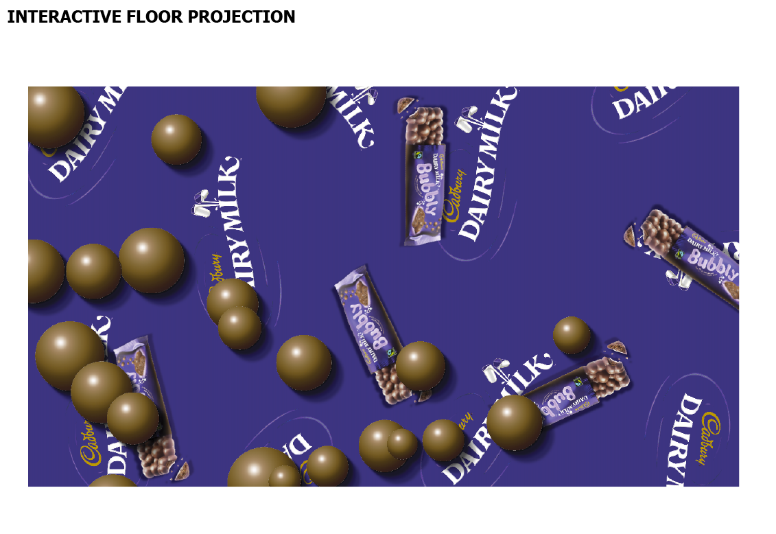
Cadbury Bubbly Bar animation
Here are my animations for the Cadbury Bubbly campaign.
The campaign consists of:
- a QR code screen animated poster that will be advertised along the escalators on the London Underground.
- the QR code will guide them to the Cadbury's site where they can order a Bubbly bar for free
- an interactive floor projection that will sensors people's movement
I have applied the screen to be viewed on an Ipad as I will be showcasing my work on an ipad for my degree show presentation.
QR code poster © Kasumi Miyake 2012
Online order form wedbpage © Kasumi Miyake 2012
Interactive floor projection © Kasumi Miyake 2012
Interactive floor projection step on © Kasumi Miyake 2012
Wednesday 9 May 2012
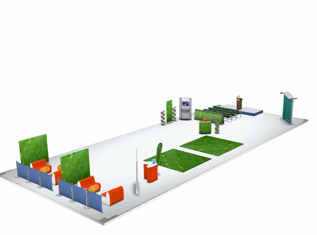
Exhibition space design
Mock up of exhibition space design for the Lung Cancer Awareness 'Catch it early' campaign.
I will need to apply the branding and promotional material on this exhibition space.


I will need to apply the branding and promotional material on this exhibition space.


Tuesday 8 May 2012
Lung Cancer Awareness
I will modify my Lung Cancer Awareness Campaign concept to be showcased as an exhibition event in major shopping malls during Lung Cancer Awareness Month.
At the event there will be posters regarding lung cancer, information leaflets, name cards with hotline services, event staff that will be able to offer guidance, support and advice, interactive floor projections, stage to host talks etc.
Draft exhibition space layout design
A quick mock up to visualise the exhibition space. I have tried to keep it simple and spacious to create a relaxed environment. Seating areas, a TV screen, posters, free information leaflets, staff who are qualified nurses/doctors, stage podium to host talks etc will showcase the event.
The floor projection will be located in the white space where the businessman silhouette is. Once the person interacts with the projection, an event staff (doctor/nurse/pharmacist) will be able to give advice, support etc. Seating areas are provided to create a more relaxed environment where people can sit down and talk to doctors any queries.
At the event there will be posters regarding lung cancer, information leaflets, name cards with hotline services, event staff that will be able to offer guidance, support and advice, interactive floor projections, stage to host talks etc.
Draft exhibition space layout design
A quick mock up to visualise the exhibition space. I have tried to keep it simple and spacious to create a relaxed environment. Seating areas, a TV screen, posters, free information leaflets, staff who are qualified nurses/doctors, stage podium to host talks etc will showcase the event.
 |
| © Kasumi Miyake 2012 |
 |
| © Kasumi Miyake 2012 |
 |
| © Kasumi Miyake 2012 |
 |
| © Kasumi Miyake 2012 |
 |
| © Kasumi Miyake 2012 |
I intend to progress with this idea and kind of visualisation to showcase my final concept. I will need to organise what information I will be presenting on the TV screens and posters. Refine the interactive floor projection concept, enhance the branding of the event through the visuals and colour usage.
Final Cadbury Project Outcome
I have worked towards creating the final outcome for my Cadbury project over the last few weeks.
I have managed to animate the QR poster, Webpage and the Interactive Floor Projection using Motion5. The stills provided demonstrate the movement of the animation.
QR Poster
Interactive floor projection
Interactive floor projection
Demonstrating projection's response to touch.
I have managed to animate the QR poster, Webpage and the Interactive Floor Projection using Motion5. The stills provided demonstrate the movement of the animation.
 |
| © Kasumi Miyake 2012 |
QR Poster
 |
| © Kasumi Miyake 2012 |
 |
| © Kasumi Miyake 2012 |
 |
| © Kasumi Miyake 2012 |
Webpage
 |
| © Kasumi Miyake 2012 |
 |
| © Kasumi Miyake 2012 |
Interactive floor projection
 |
| © Kasumi Miyake 2012 |
 |
| © Kasumi Miyake 2012 |
Demonstrating projection's response to touch.
 |
| © Kasumi Miyake 2012 |
Friday 27 April 2012
Cadbury bubble animation and lung project floor projection animation
I have animated the bubbles for the QR poster and the webpage to give a better visualisation to present how they would appear to the audience in correlation with the interactive floor projection.
QR poster animation © Kasumi Miyake 2012
Webpage order form animation © Kasumi Miyake 2012
I have adapted the circles of the Lung Cancer Awareness Floor Projection to the lung shapes to anchor the lung cancer awareness message and app logo. I have decided to also use Motion5 to present how the interactive floor projection would work in context. Here are screenshots of what I have managed to animate so far.
 |
| © Kasumi Miyake 2012 |
 |
| © Kasumi Miyake 2012 I have yet to add the tag lines: smoker? non-smoker? onto the lungs. |
 |
| © Kasumi Miyake 2012 |
When the user taps onto a lung the lungs capacity with change. The smoker's lung capacity will decrease to visually show their 85% chance of contracting lung cancer.
I have yet to add the percentages onto the lungs.
Tuesday 24 April 2012
Project Developments
My mid-term tutorial feedback focussed on allowing myself to focus on refining my designs and prioritising my projects so that I could finish all the projects to the best standard in the time that I have left.
I received positive feedback for my Cadbury, Zara and Palmer's project- just getting the final presentation finished. However, I still need to refine my Lung Cancer Awareness Project and Amazon Gift card service project.
CADBURY
Poster design
 |
| © Kasumi Miyake 2012 |
The earlier poster development I had was in the form of a square but considering that most posters are rectangular I have adapted the composition. I have rendered the bubbles by creating my own bubbles in Photoshop so that it would fit with the aesthetic of the floor projection animation.
Webpage delivery form
 |
| © Kasumi Miyake 2012 |
Likewise, I have applied the bubbles onto the webpage.
If I have time I could possibly animate the bubble so that they move around like the floor projections animation.
Interactive Floor Projection Animation
 |
| © Kasumi Miyake 2012 |
 |
| © Kasumi Miyake 2012 |
I have attempted to animated the bubbles to show that when a person steps onto the projection the bubbles will move away from the person. I have been finding it challenging to find a way to capture the right moving movement as if the bubbles are repelling the person. At the moment, I have only managed to get the all bubbles to float away gradually.
LUNG CANCER AWARENESS
Floor projection Beginning
 |
| © Kasumi Miyake 2012 |
 |
| © Kasumi Miyake 2012 |
The Lung Cancer Awareness projection can be further adapted so that the visuals is more identifiable with lung cancer. At the moment the circle projection can be applied to any concept.
I have considered changing the circles to lung shapes, but considering how the circles shrink, the visual would not be anchoring the message as the lung appear to get smaller, they will appear to look weaker.
I will need to find a solution to the visual aesthetic of the lung cancer projection so that people can easily recognise the projection is about lung cancer.
PALMER'S HAND CREAM REDESIGN
Poster design
 |
| © Kasumi Miyake 2012 |
 |
| © Kasumi Miyake 2012 |
Saturday 21 April 2012
Palmer's second round feedback refinement
Receiving feedback to test my product design and poster design for my Palmer's project has been critical in influencing my design decisions. The questionnaire I conducted made a big influence in changing my design solution for the hand cream. Although I was quite satisfied with the design aesthetic for the most latest development, I conducted another form of feedback by asking people to write their thought on the product design and poster designs on a post-it note.
Some remarks that appeared to be brought to attention regarded about activity, colours and tagline of the posters. There were no remarks on the improvement of the product design. A suggestion made to incorporate the old packaging with the new packaging was made which may be quite useful so that current customers can easily appeal to the new product by recognising the old product design.
Based on the remarks and suggestions, I have modified the poster designs.
Old with new product design
 |
| © Kasumi Miyake 2012 |
Thin border
 |
| © Kasumi Miyake 2012 |
Gradient shine
 |
| © Kasumi Miyake 2012 |
Deeper red
 |
| © Kasumi Miyake 2012 |
Light to darker gradient
 |
| © Kasumi Miyake 2012 |
Subscribe to:
Posts (Atom)